Laying Out Speech Bubbles
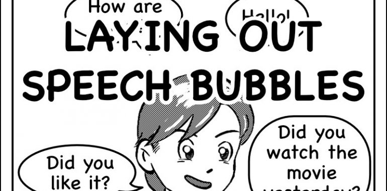
Laying Out Speech Bubbles
Speech bubbles are a key part of a manga. With drawings, they bring a big part of the understanding of your story to your readers. This is why properly laying out your speech bubbles is important, as wrongly doing it can confuse your readers.
Note that I have several articles around that topic that might also be of interest for you:
You will also find these links at the bottom of the article.
Why is it important to correctly position speech bubbles in a panel?
When you have multiple text bubbles in a single panel, it is important that you properly position each of them.
A wrong positioning of your bubbles might lead your readers to read your bubbles in the wrong order.
This will irritate them and slow down their reading if they notice it. Or they will misinterpret the situation, or find it strange, if they don’t.
In the end, if the problem repeats too often, you might lose your readers. At the best, they can find some parts of your story weird. But this might also lead your readers to get bored and quit reading your manga. And whatever you think or say, this will not be the fault of the readers.
This is why it is important to understand some basic principles to properly position your speech bubbles.
Readers and panel scanning
Traditionally, a manga is meant to be read from top to bottom, and from right to left.
This way of reading influences the way a reader’s eyes scan a panel for content, and notably text bubbles.
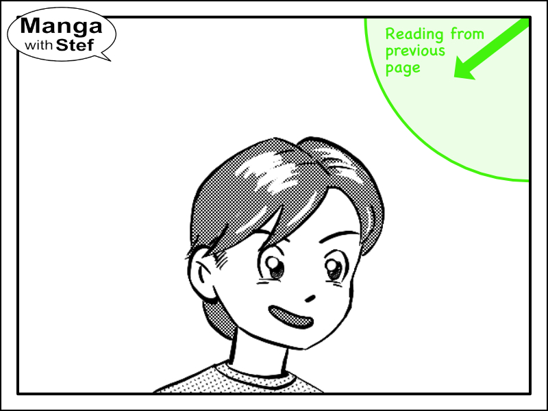
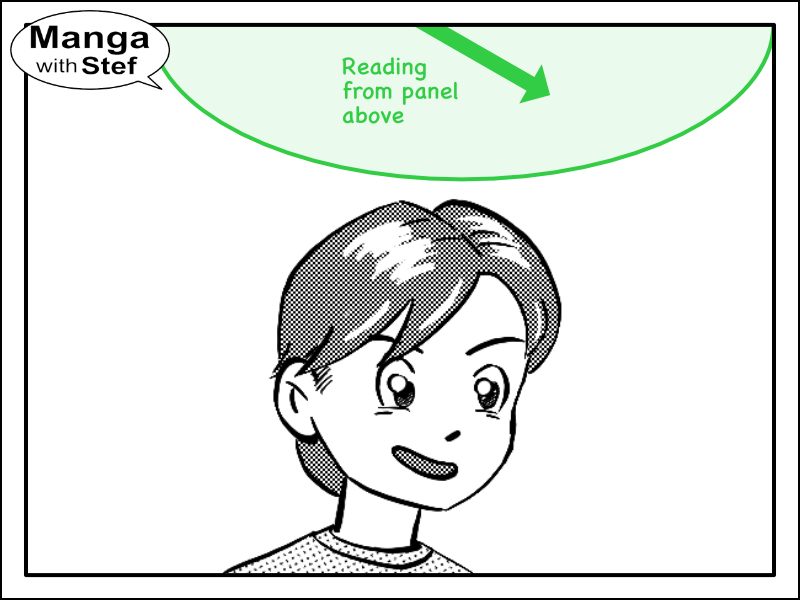
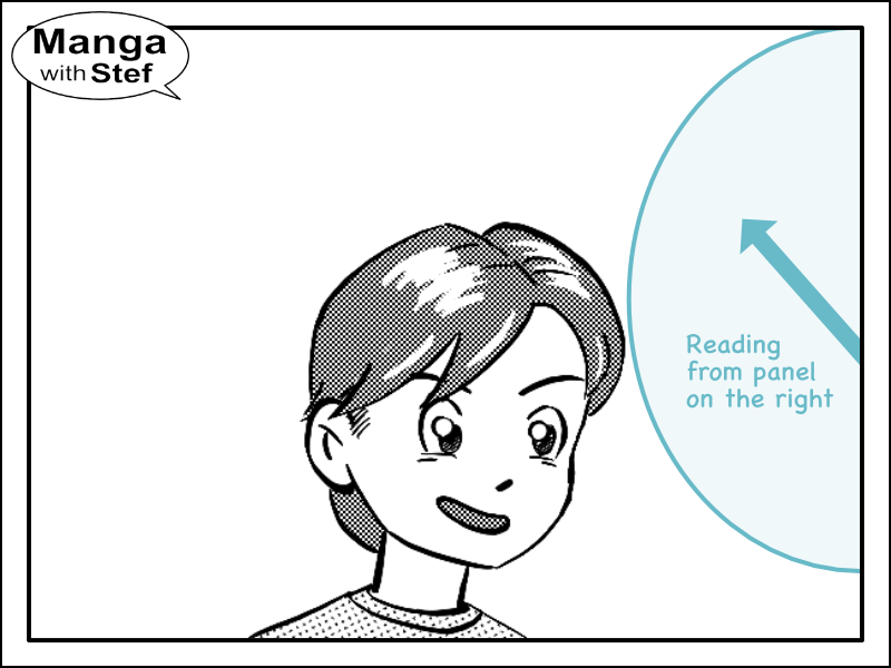
Variability of the scanning starting point
The first element to have in mind is the location of the previous panel. The path that the eyes take to read a panel will influence the area it will focus upon as illustrated with the 3 images below. A bubble placed by mistake in that area will therefore catch attention first and influence the reading order. We will see examples of that point later on.
The reading pattern
Then, once in the panel, the eyes will scan for content from the top right corner to the bottom left one. The picture below illustrates that point:
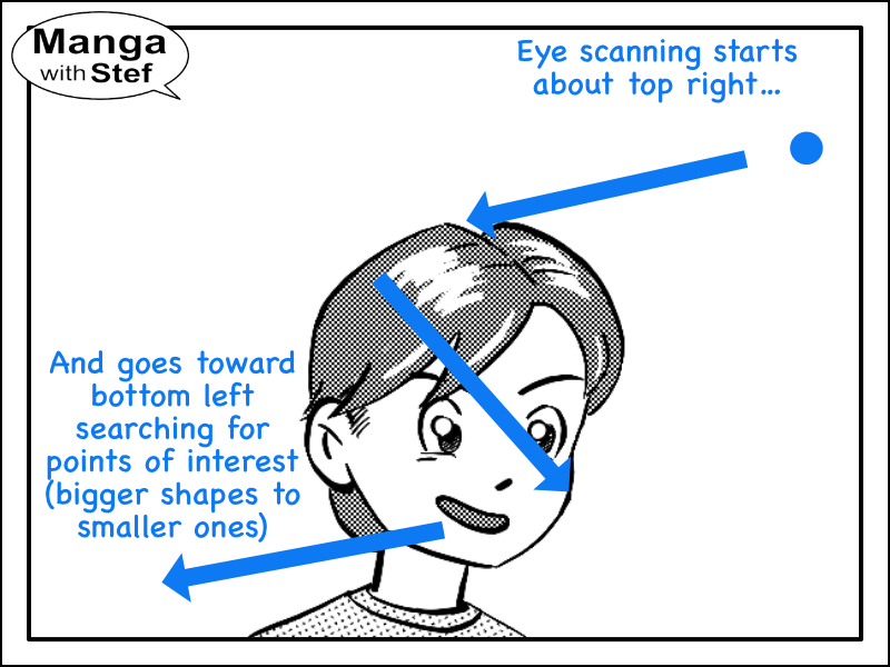
The eyes will do a quick Z scan (or S scan in the case of a manga) of the panel, looking for elements to catch the attention. The brain will basically look for contrasts (large shapes, isolated shapes…) and stop to quickly look at that element. The point will therefore be to properly balance the size and contrast of the bubbles in regard to the other content of the panel as discussed in my article on composition. This is why bubbles have round or rectangular shapes and have a white background, this makes them pop out of the panel content.
The reading diagonal
All in all, this reading order forms a reading diagonal which it is important you have in mind when positioning your bubbles.
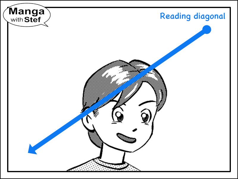
Don’t hesitate to have a look at your favourite manga to see how this diagonal is used.
Note: for a comic or manga using the left to right reading order, you will have to invert right and left.
Positioning a single speech bubble
If you have a single bubble, there isn’t much risks of misleading your readers. But you can still play with the positioning to influence your readers.
If the speech bubble is near the top right/right, readers will generally read the bubble first, before having a look at the remaining content in the panel. And if the bubble is near the bottom left/left, readers will read the bubble after having looked at the content of the panel.
As I said, this can be used to create a sequence between the content of the panel and the content of the bubble.
Positioning two speech bubbles in a panel
When you have two bubbles in a panel, you have a lot of options to lay them out. This can be horizontally, vertically as pictured below.
Horizontal speech bubbles layout
Here are some examples of horizontal layouts. You can easily see that there is no problem reading the speech bubbles in the correct order.

The inconvenient of this speech bubble layout is that it can create some unwanted symmetry. To avoid that, you can slightly offset the speech bubbles vertically the one from the other. This will avoid creating an horizontal line of text and make the movement of the eye more fluid.
Vertical speech bubbles layout
Here are now some examples of vertical layouts. Here also there is no problem reading the speech bubbles in the correct order.
Using the reading diagonal to lay out your speech bubbles
Now let’s have a look at the diagonals. There are two of them: the reading diagonal which we have seen above, and the anti-diagonal (the diagonal “perpendicular” to the reading diagonal).
Using the reading diagonal causes no trouble and generally looks nicer. You will see it quite often used in manga as it fits the reading flow very well.
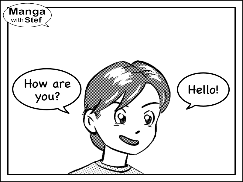
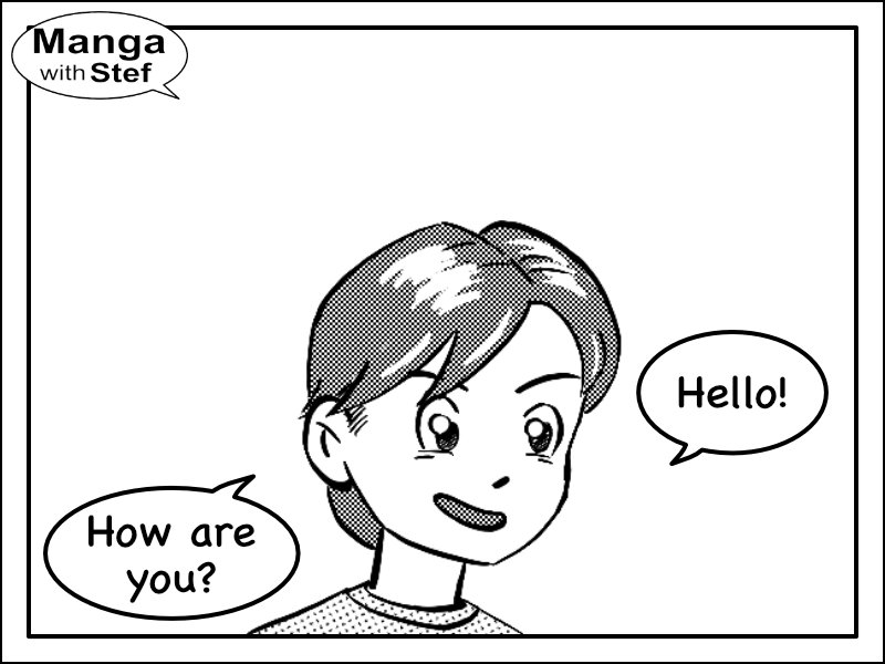
The problem of using the anti-diagonal
But using the anti-diagonal can be troublesome! Depending on where your readers come from (top panel, panel on right or previous page) and the size of your bubbles this layout can be problematic.
Have a look at the example below:
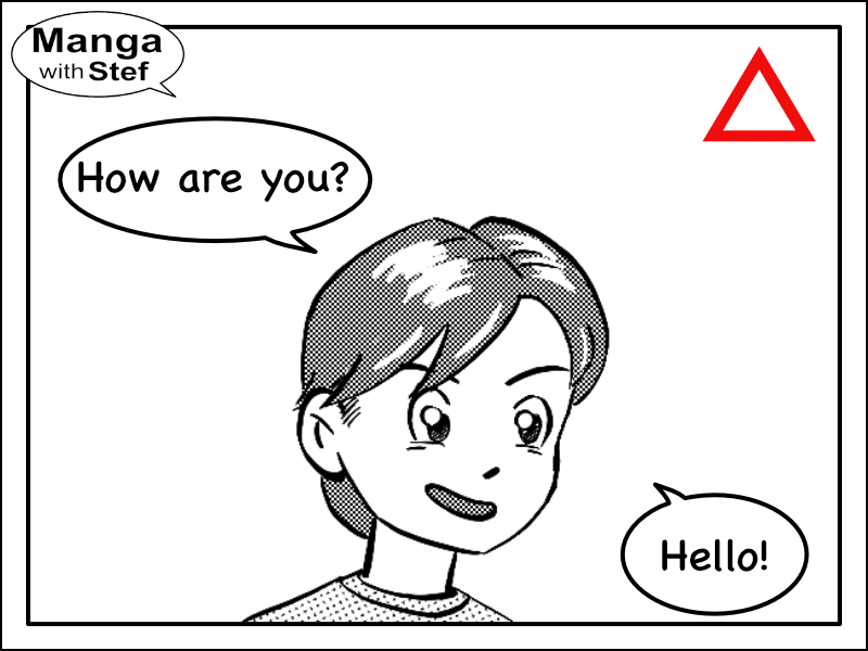
There is a high chance that you read the second bubble: “How are you?” before the first one: “Hello!”.
There are 3 reasons for that:
- You were reading from top to bottom, making the top speech bubble the first one to be accessible to your eyes.
- The second speech bubble is also bigger than the first one, making it more obvious to the eyes.
- The S scanning of the content along the reading diagonal will also lead the reader to scan around the top left corner before the bottom right one.
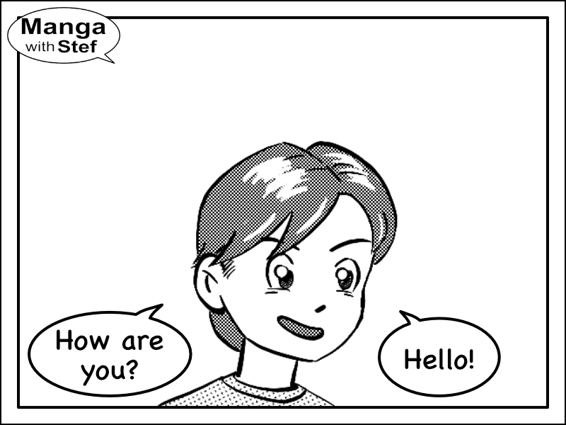
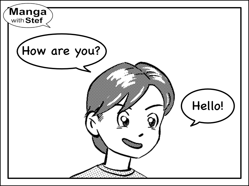
Solving the issue
If possible, first try to use one of the other layouts presented above.
But if you don’t have the choice because of the content of your panel, here are a few tricks you can try to use.
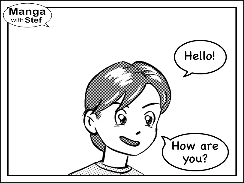
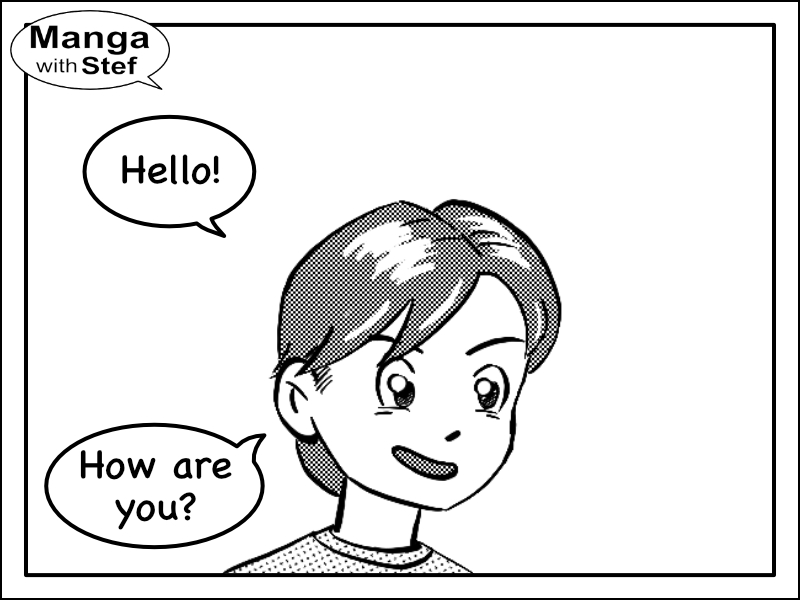
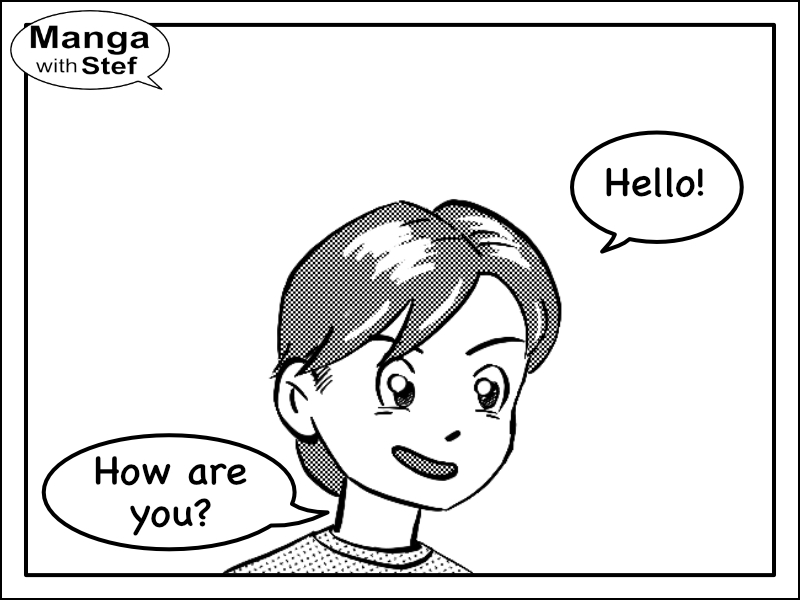
Your first option is to try to move that first bubble up toward the middle of the panel, bringing it closer to the reading diagonal.
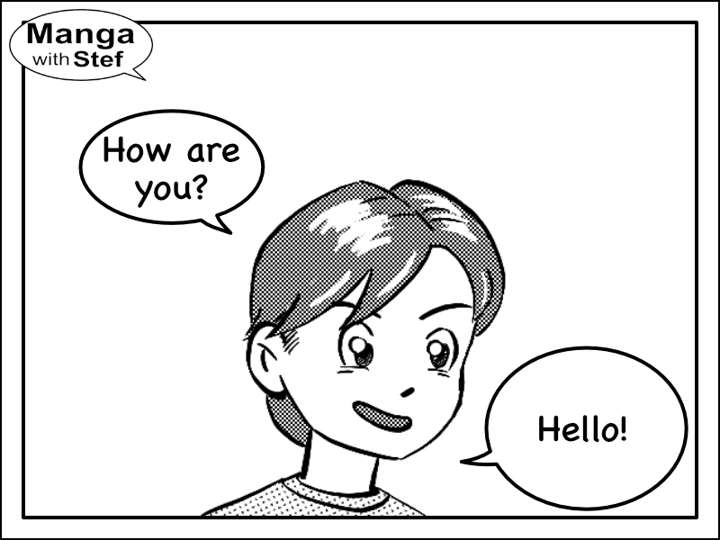
If you can’t, then the other option will be to make that first bubble more obvious. This can be straightforward if you have more content in that first bubble. And if not, like in my example, try to enlarge it and make it bigger than the second bubble.
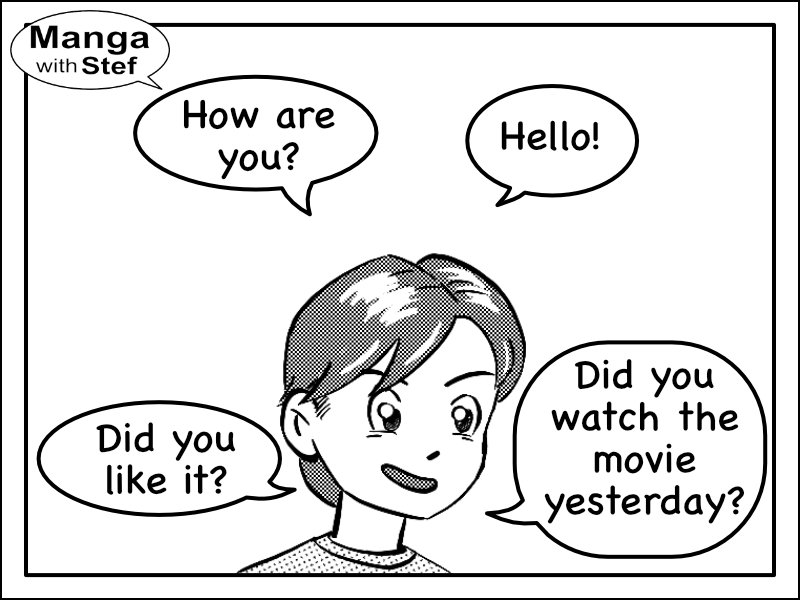
Positioning 3 speech bubbles in a panel
Again, the best practice is to use horizontals, verticals or the reading diagonal as a guide.
If you can’t use these, then you will again have to be cautious. The positions to be favoured will be either above the reading diagonal, or below it.
The first two images illustrate a good use of the reading diagonal.
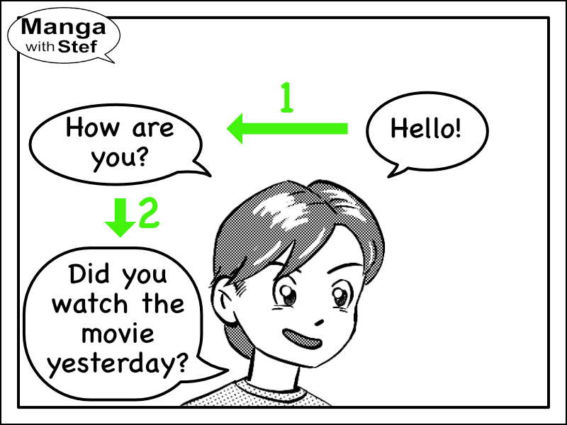
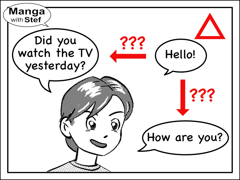
But the problem arises again when using the anti-diagonal as a guide. In the example below, because the third bubble: “Did you watch the TV yesterday?” is bigger than the second one: “How are you?”, there is a high probability that it is read second.
The way to solve the problem, though is quite similar to what we have seen previously:
- Either bring the second bubble up. This will reduce the space between that bubble and the first one and ease the transition of the eyes from the one to the other. We will see that in more details in the next part.
- Make the second bubble bigger than the third one.
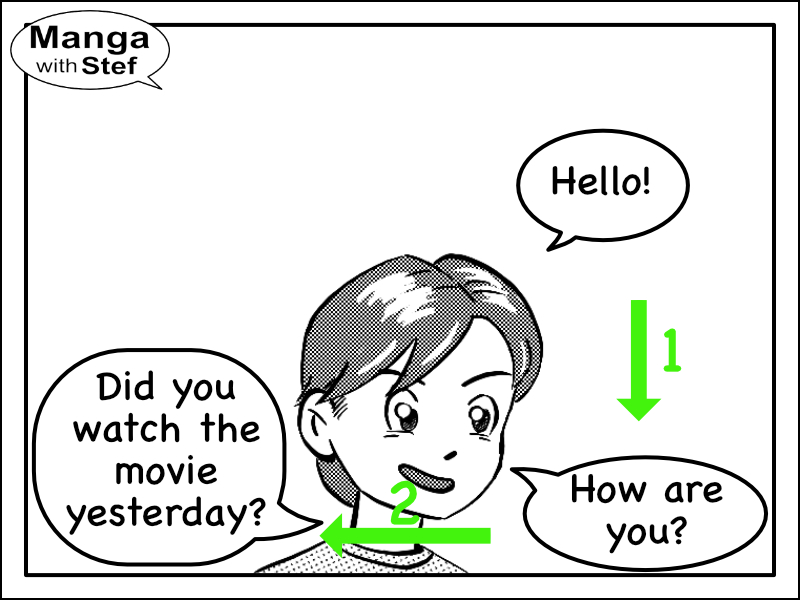
Laying out text bubbles in the four corners
The last tricky situation you can be facing when laying out your bubbles is to have bubbles at the four corners.
Look at the following example:
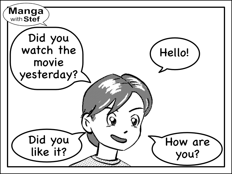
The text is intended to be read first the two bubbles on the right, then the two bubbles on the left. But again, as the third bubble is bigger than the second one, there is a high probability that the reader will read that third bubble second, mixing up the content.
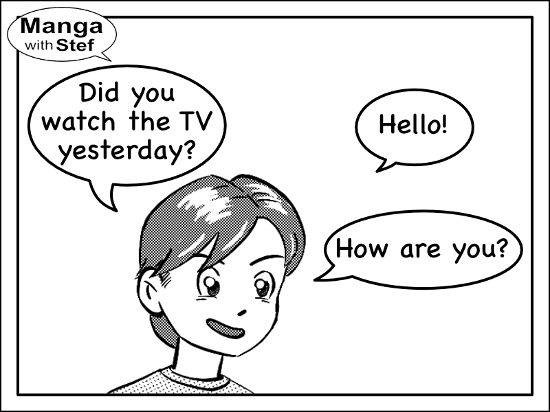
The same problem could happen if the bubbles had been laid out to be read horizontally:
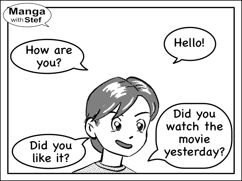
We could again use larger second bubble. This would work, but this could quickly lead to the bubbles to overcrowd the panel.
Happily, as evoked in the previous part, there is an easy way to manage the situation.
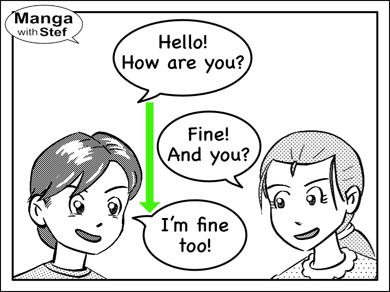
Manage space between bubbles to drive the reading flow
Our brains have some automatisms that we can use to invite the readers in doing what we expect.
We saw a first principle which is the fact that the brain will look for elements with contrast.
A second one is that the brain makes more easily the link between elements that are close the one from the other, than between elements that are at a distance.
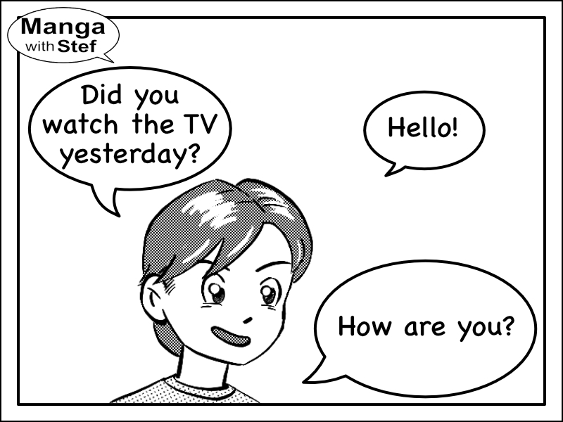
If we look at our previous panel, we can see that the spacing between the bubbles is too similar. It doesn’t help the reader in choosing the correct option.
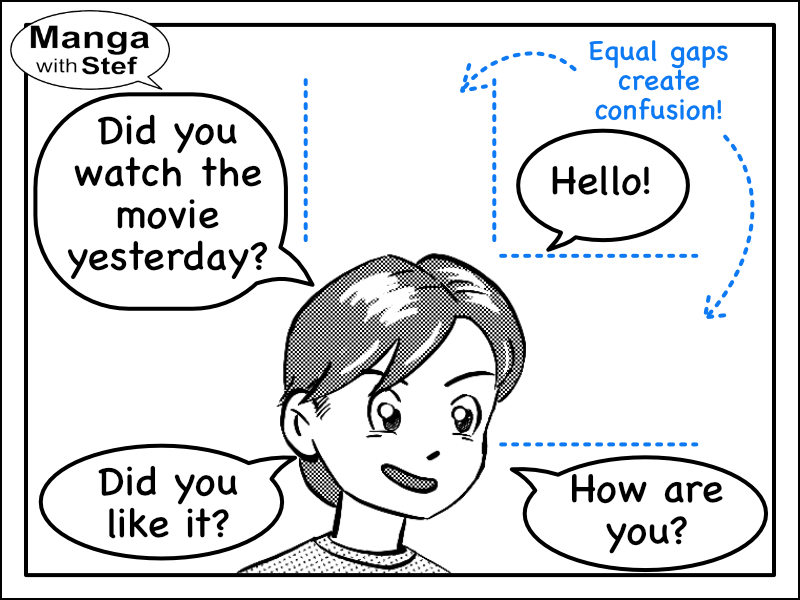
Let’s see what happens if we bring the first and second speech bubbles closer the one from the other:
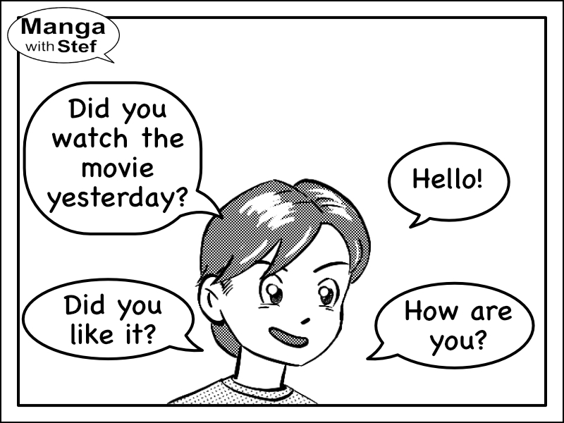
As you can see, because I reduced the spacing between these bubbles, reading them in the correct order becomes easier.
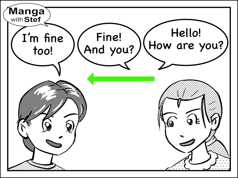
And the same works with an horizontal pairing of the bubbles:
Principles of laying out text bubbles
Here is a summary of what we have seen up to now in this article.
To ensure your readers will read your bubbles in the proper order:
- Lay out your bubbles either horizontally, vertically or along the reading diagonal
In the case you cannot follow this first principle:
- Drive the eyes of your readers. For that purpose, play with the size of your bubbles and with the distance between them.
Managing speech bubbles in a dialog
The principles we have seen above are still applicable in the case where two characters are talking to each other.
You can simply alternate questions and answers in one of the standard reading directions (vertical, horizontal, reading diagonal).
And if you have a lot of text, make sure you use proximity between questions and answers.
As I mentioned in the introduction, here are some other articles around the topic:
I hope you liked this article.
Do not hesitate if you have questions or comments.
Stef