Manga Panelling Basics
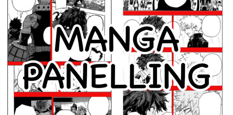
Manga Panelling Basics
Manga panelling is the practice of defining the layout of the panels in your manga pages. This is a really important skill as a wrong panelling might cause your readers some headaches and confusion. A good panel layout is here to guide the eyes of your readers through your manga and make the experience pleasant.
In this article, you will discover the following things about panels and panelling:
- What are panels?
- What is panelling and why is it important?
- How to prepare your story for panelling
- Some facts about how our brains work when reading manga pages
- How we can influence the brain by using space between panels
- How to remove distracting lines by offsetting panel borders
- How to use panel size to make your story more interesting
Here is a quick visual summary of what we will see in this article:
What are panels?
Panels are frames containing drawings and text under the form of captions or text bubbles.
They can be used alone, or in a sequence to count a story. As such, they are the base component of manga, comics and bandes dessinées.
Panels may have a border. And when used in sequence, panels may be separated by a gutter.
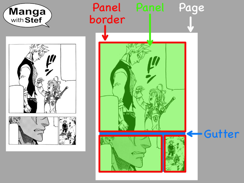
Source: Seven Deadly Sins © Nakaba Suzuki, Kōdansha
Panels appeared in occident before the mid 1800s to illustrate short stories (comic strips). Around the same time, the Japanese artist Hokusai published the 15 volumes of the Hokusai Manga. Despite the name, though, the panels were independent the one from the other. They were picturing scenes from every day life and not counting a story like nowadays manga.
What is panelling and why is it important for your manga?
Panelling is the process of structuring and designing panels for a comic.
Panelling was a very trivial process in the early times of manga and comic strips. Generally all the panels of a comic strip were rectangles of equal size laid out horizontally or on two lines or columns.
But as comic strips and manga got more popular in the early 1900s, the structure and shapes of the panels started to evolve and to become part of the storytelling in itself.
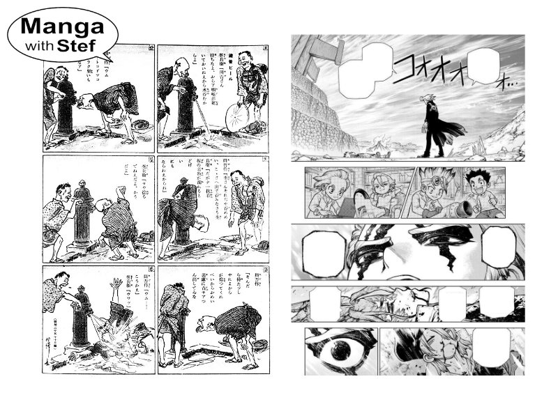
Left: Tagosaku to Mokubē no Tōkyō-Kenbutsu © Rakuten Kitazawa in Jiji Manga, 1902
Right: Dr Stone © Riichirō Inagaki, Shūeisha, 2022
And nowadays the panelling is as important as the story, if not more:
If a good panelling can sublimate a story by making it more dynamic and graphically impacting, a bad panelling can totally destroy a good story by making it look broken and sloppy.
Panelling is therefore a key skill to master for any artist willing to draw exciting manga stories.
Preparing for the panelling of your manga pages
When you make a manga, this is to convey a story you imagined, with all its actions, emotions and atmosphere, to your readers.
To be efficient in term of impact, panels must therefore be meaningful and useful to your story. It is therefore important that you prepare the content of your panels ahead of time, before you start drawing. If you don’t, there is a high probability that half of the panels you will draw will make no sense or bring nothing to your readers.
This is where scripting your manga pages will bring you clarity.
Scripting will allow you to write down what you have in mind, to get rid of the secondary elements and to focus on the parts that are important for your story.
As a reminder, the script shall include for each scene:
- Setting
- Atmosphere
- Characters
- Actions
- Emotions
- Dialogues
As you read that, you should you should be able to picture the panels corresponding to these elements: a forest crossed by a road; a bird singing; characters on horse back, happy to have some spare time and chatting about their next destination…
Now that you have your content, you can start thinking about your panelling. But before that, there are a few notions that are important to understand to be efficient in that process.
How many panels in a manga page?
A manga page will contain on average between 3 and 7 panels.
You can of course have less, with double page panels, full page panels or two panels in a page, but these should not be a standard. If you have many pages with too few panels, and moreover if you have little to no text on these pages, readers will quickly consume them and get the feeling to not have had enough.
You can also have more than 6 or 7 panels. But your pages will start to get dense and potentially difficult to read. And again too many panels with too much content will slow down the scanning pace of the readers. This can lead them to feel some strain, and to skip some panels.
When shall I use double page and full page panels?
Such panels are generally reserved for key moments of your story. It should be a way for your readers to share great moments with your characters. Be it moments of awe, joy or despair.
Key moments can be the discovery of the treasure your characters chased for months or years… The dream car your main character worked for years to buy… The destruction of your hero’s planet by the villain… A double page can also be used to display a long awaited confrontation between some characters (enemies, friends or lovers).
Or you can use them to uncover key settings and generally outline their grandiosity. This means you won’t use full pages for a mere stage town on the journey of your characters.
Such large panels can also be used to introduce characters. Single page when you have a few characters (between 2 and 4 of them), and double pages for more. Single characters are generally presented on a half page full height panel.
Reading patterns
Now, that we have content and an idea of the different tools we have at our disposal to show display that content, the part that remains is to lay out our panels. To understand the principle, let’s first have a look at some facts about how our brain functions.
The eye scan pattern
When reading a book or a comic, the eyes will perform what is called a Z scan pattern.
Similarly, a manga in the traditional style will be read from right to left, and from top to bottom. The eyes will therefore be performing some king of “S scan pattern” (note this isn’t a standard naming, contrarily to the Z scan pattern).
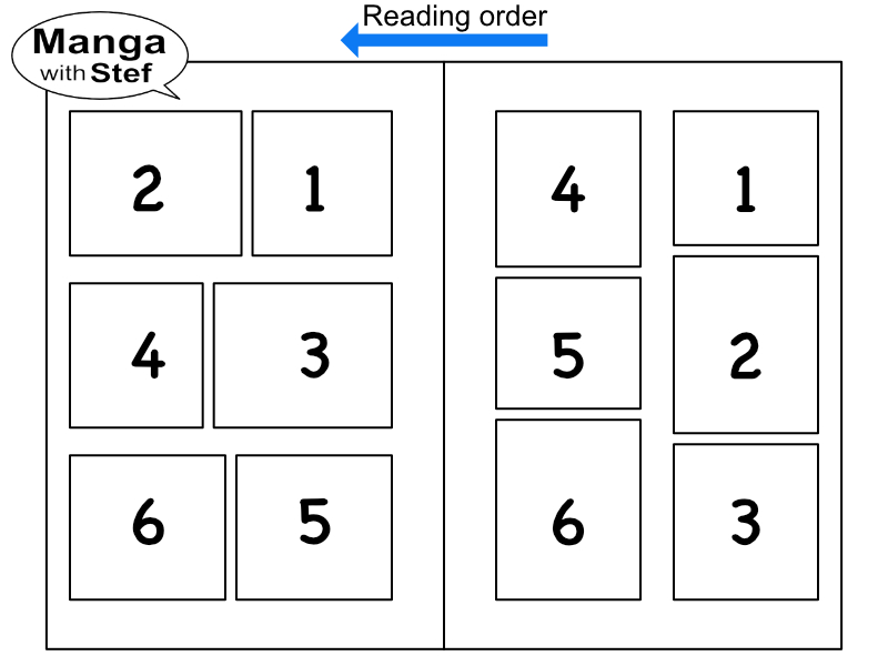
To illustrate that, lets see how the eyes scan a basic 2 pages layout, with 3 rows of 2 panels on each row on each page:
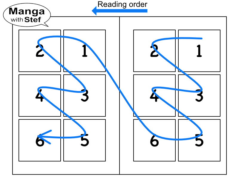
As you can see, the way you read through the different panels forms like a sequence of S shapes.
Gaps and lines guide the movement of the eyes
Now, if you think of a book or of an article in a newspaper or a magazine, what makes that your eyes go to the next line?
Generally, there will be two elements:
- Either our eyes encounter a gap larger than the gap found between words. For instance the margin between two pages of a book, or the space between two columns. This larger gap is understood by our brain as the end of the line of text, and a signal to move to the next line.
- Or our eyes encounter a barrier. This can be a separator or the border of a picture for instance. This is also perceived by our brains as the signal to move to the next line.
Basically, our brain tries to limit the energy consumed by our eyes to move. Larger gaps and barriers are perceived as requiring more energy to be crossed than space between words or lines, therefore our brain will try to avoid that effort.
And what is true for words in a sentence is also true for panels in a page.
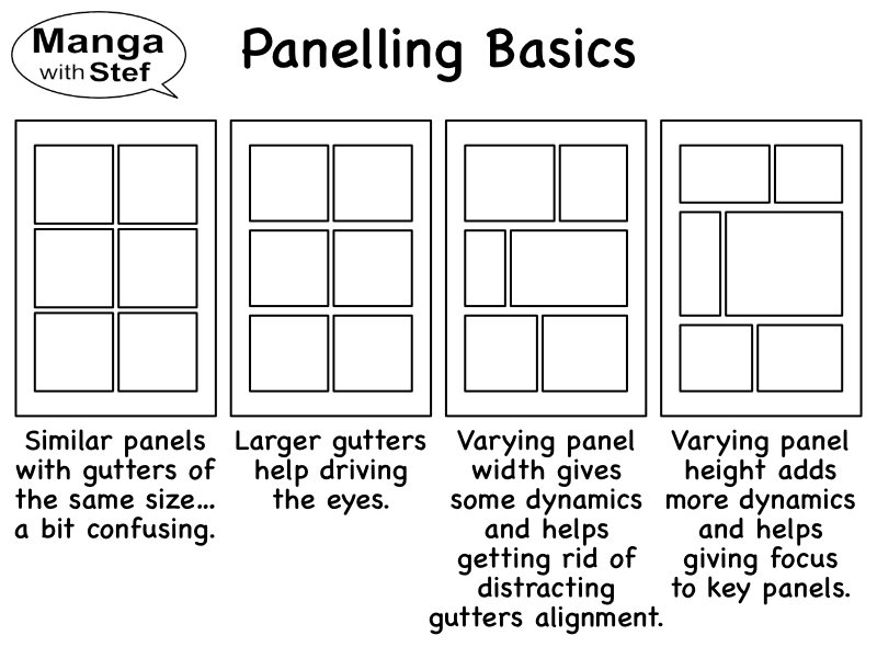
The use of these gaps and barriers will therefore be our primary assets for the panelling of our manga pages. Their understanding will allow us to move away from the grid like panelling and to make something interesting.
Using gutter width to uncouple the panels
A first way gaps can be used is to guide the brain and eyes in reading our panels in a direction or another.
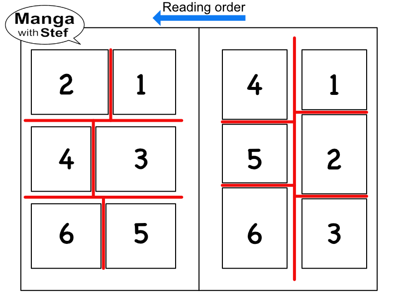
For instance, enlarging the gutters between your panel rows or columns will create a barrier that will guide the brain in following the path with smaller gaps.
Let’s see how this can apply with a basic layout of 3 rows with 2 panels on each row.
With equal distance between columns and rows, our brain will have a tendency to hesitate and to search for its way through the page.
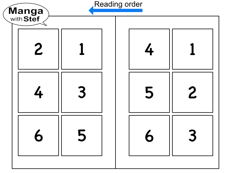
By enlarging the space between the columns, our brain will favor reading vertically before moving to the next column. We might have some slight hesitation at the start as reading vertically might not be usual to us. But once on the right track, the reading gets smooth.
And by enlarging the space between the rows, our eyes will start to prefer reading horizontally before moving to the next row.
What shall be the size of the gutter between manga panels?
Small gutters will generally have a size of between 1 and 2 mm, or between 0.04 and 0.08 inch, on the published page.
Big gutters will be around 3 times the size of a small gap. This means between 3 and 6 mm, or between 0.12 and 0.24 inch.
Offsetting panel borders to further guide the eyes
We can also ease the reading of our manga panels by offsetting the position of the interval between the panels from one row to the other. The fact that the gutter between two panels leads to a perpendicular line, a barrier, will discourage our eyes from moving that way.
This is better illustrated with an example:
This offset breaks any lines perpendicular to the desired reading direction, making it more difficult for the eyes to follow this path.
And of course, we can mix larger gutters and offsetting to enhance the effect.
Have a look at your favourite manga! You will see that manga artists use these panelling tricks on almost every page they draw.
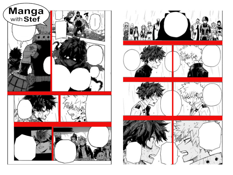
The bubbles that cross the central border help in reading these panels horizontally by breaking the barrier.
On the left, example of panels with offset borders to foster horizontal reading.
Source: My Hero Academia, Copyright © Horikoshi Kōhei, Shueisha / Viz Media
But don’t cast aligned panels away as they can have their own effect, too, by creating symmetry.
Using panels of different sizes
Panel borders, as we have seen, are perceived as barriers difficult to be crossed. Using that property allows to mix panels of different sizes and to guide our readers throughout our page. This allows for more complex and interesting panelling in our manga.
The following picture shows the different panel layouts you can achieve on a 2 columns x 3 rows grid basis.
Note there are two panelling identified with a red triangle. You can try to use them, but be aware that they can be confusing for your readers. If you want to use them, I will show you some tricks in an advanced manga panelling article.
What to use big and small panels for?
One key element to master for a good panelling of your manga pages is the meaning of the size of the panels.
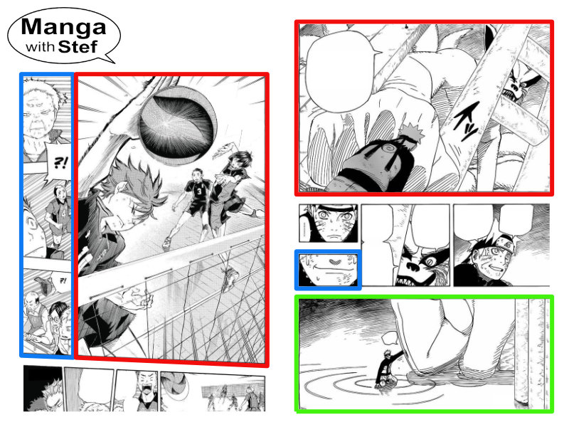
On the right, a big panel (in red) used to show a difference of scale, and a small panel (in blue) highlighting a quick change in behaviour, and a more standard size panel (in green).
Source: Haikyū!! (left) © Haruichi Furudate, Shūeisha, Naruto (right) © Masashi Kishimoto, Shūeisha
Big panels
A big panel is a panel that will take more than a third of the surface of a page.
The bigger it will be, the more it will attract the attention of the readers and increase their level of expectation regarding its content.
A big panel content shall therefore be adapted to the size:
- It can be used to show a complex scene (lots of details, action lines…) that would look crowded in a smaller panel,
- Or it can be used to allow for a complex part of a discussion,
- Also, you can use it to highlight a key moment of a scene, like a local climax (a new character making its entrance, a blow finally hitting its target…)
- Finally, it can be used to show the comparative scale of elements (a character facing a giant or a mountain…)
Limit to the minimum the use of big panels to display secondary or filler content (a manner to consume space with nothing). Readers will spot it without a doubt as it will attract their attention but not bring them the expected emotions. You can do it exceptionally to end a chapter or in between two big scenes, where it can bring some tension relief. But this should not be done too often to avoid readers feeling they are wasting their time looking at pages empty of value for the story.
Smaller panels around a big panels shall be used to prepare the climax, and as an aftermath of this panel.
Small panels
Smaller panels, on the other side, will occupy a sixth or less of the surface of a page. This means that they cannot hold a lot of content and that they are therefore here to show small or secondary details and to be read quickly.
Generally, they will help showing the atmosphere of a scene: a bird singing, petals floating in the air, people chatting secretively…
They can also be used to show some secondary scenes or fillers. The main characters leaving a room, the sun setting down, or just some patterns of gradients to make a transition between two scenes.
But they can also be used to show key elements. Elements that are meant to be caught in the blink of an eye. This can be an hand reaching for something in the back of a character, a quick smile after a character tricked another one… Or the kind of element that might be quickly overlooked, like a piece of paper fallen on the floor, but having a deep meaning for the continuation of the story. It can also be a single word..
Finally, along bigger panels, small panels can be used to highlight details. This can be the faces of some characters following a larger group shot…
Standard panels
What remains are the standard panels, that is to say panels that occupy between a third to a sixth of the surface of a page.
These panels are meant to set the pace of the story. They will bring a piece of the action or of a dialogue, before the reader moves to the next panel.
As a next step, you might be interested in either learning how panel content composition works to add even more pop to your manga.
I hope you now have all the tools you need to create great manga panelling!
Do not hesitate if you have questions or comments.
Stef