Manga Panels Composition Principles and Applications
Manga Panels Composition Principles and Applications
A good layout of the panels in your manga pages is essential. But to be efficient you must also have a good composition for your manga panels. Composition will allow you to influence the way your readers will look at your panels. And by doing so you will also be able to influence their emotions.
I will present some of the fundamentals of composition so that you can design forceful scenes and avoid some of the pitfalls of composition.
Composition principles
The objective of composition is to position the elements being drawn within a frame in order to create an emotion in the viewers mind. Generally this emotion will be a sense of harmony, hierarchy, balance. But it can also create discomfort or confusion…
Throughout centuries, visual artists have been studying the different manners to compose their paintings or pictures. These studies have lead to different principles that can be applied to render some specific effects.
Let’s have a look at some of the composition principles that are the most commonly used in manga:
- Centre composition
- Symmetry
- Balance
- Rule of thirds
- The Divine Proportions, aka Golden Ratio
Centre composition
Centre composition is a composition principle where the subject of the drawing is placed at the centre of the panel.
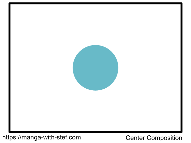
This central position allows to give this subject full focus, making all that is around secondary to the scene.
The effect can be reinforced by removing details around that centred subject. You can also use this centre as the convergence point of the perspective lines of your scene.
Symmetry
The technique of symmetry consists in having one half of the drawing mirrored onto the second half.
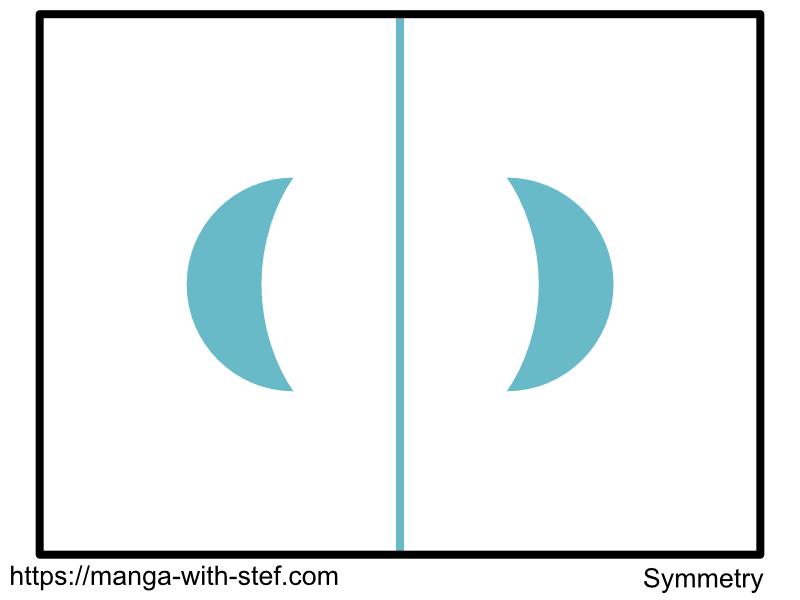
According to the context and subject, this technique can lead the reader to experience satisfaction, or tension:
- Satisfaction when offered a subject to admire due to the high aesthetic value of symmetry.
- Tension when having to make a choice. Both choices will seem to be equal and the symmetry will offer no indication on which is the best.
Balance
The principle of balance consists in positioning two or more elements in a frame while avoiding any hierarchy effect. All elements will have a seemingly equal weight.
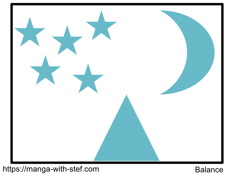
Balance can be achieved through by having elements of similar properties or of compensating ones. Similar properties can be size, brightness… Compensating properties can be size versus number, big and dull versus small and bright…
In a manga, this can also be coupled with more abstract elements known to the reader. For instance few strong characters versus many weak ones will create a sense of balance.
The objective of balance being for the reader to experience harmony. This therefore means that you can use unbalance to create the opposite effect. Having unbalance will make readers experience some kind of discomfort with one element taking over the other ones.
The Rule of Thirds
The main objective of the rule of thirds is to ease the reader interpreting the content of a drawing. It helps creating hierarchy in your drawing, as well as to highlight key elements.
The Rule of Thirds consists of two principles:
You create hierarchy between subjects by having the first subject occupying 2/3 of your frame, and the other 1/3. The first subject will attract the gaze of your reader first due to its proportion. Then the reader will move to the second subjects.
Then, you can highlight your subject by positioning them on the line of thirds or your frame. The line of thirds are the lines that cut your frame into 3, either horizontally or vertically. The points where these lines cross are called focus points and attract even more the eye.
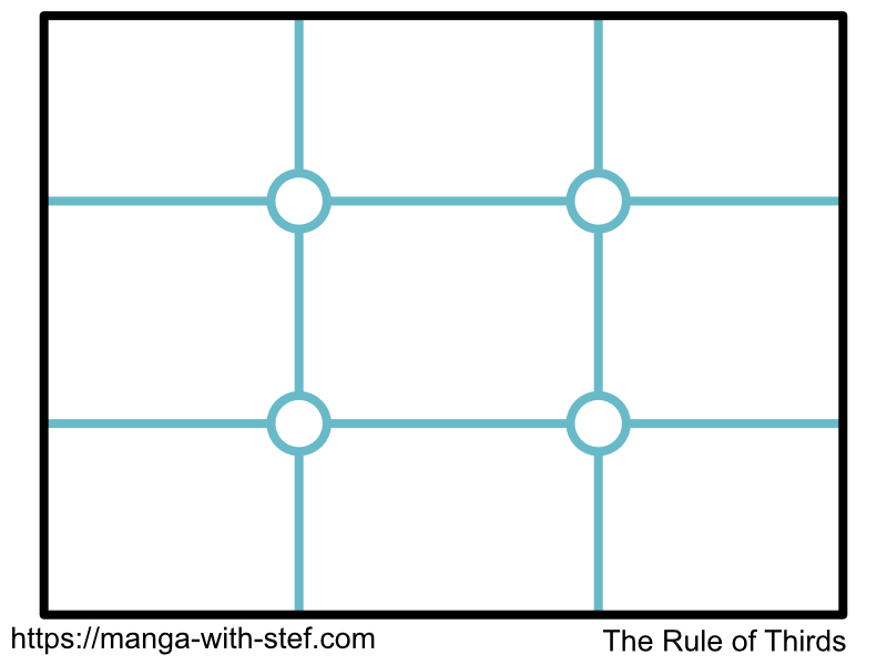
The lines of third are therefore ideal to place the boundaries of the elements of your settings. This can be the limit between the sky and the ground. Or the border of a building and the street…
As for the focus points, they are the positions that viewers’ eyes will look at first. Placing any subject on one of these points will highlight it and make it something dominant. This is therefore a position to favour to place the head or eyes of your characters.
One advantage though, is that the position of these focus point make them non-obstructive. They still give room to position other elements in the scene. This is somehow different from to the centre composition.
The Divine Proportion or Golden Ratio
The Divine Proportion is a composition rule derived from the mathematical formula of the Golden Ratio (1.618…) and one of its representations: the Fibonacci spiral.
You can build the Fibonacci spiral using quarter circles. The radius of each quarter circle follows the Fibonacci sequence defined by: F0=0, F1=1, Fn = Fn-1 + FN-2. This give the following numbers from F2: 1, 2, 3, 5, 8, 13, 21, 34, 55…). The ratio between two consecutive numbers in this sequence is an increasingly precise approximation of the Golden Ratio (34/21 = 1.619…; 55/34=1.617…).
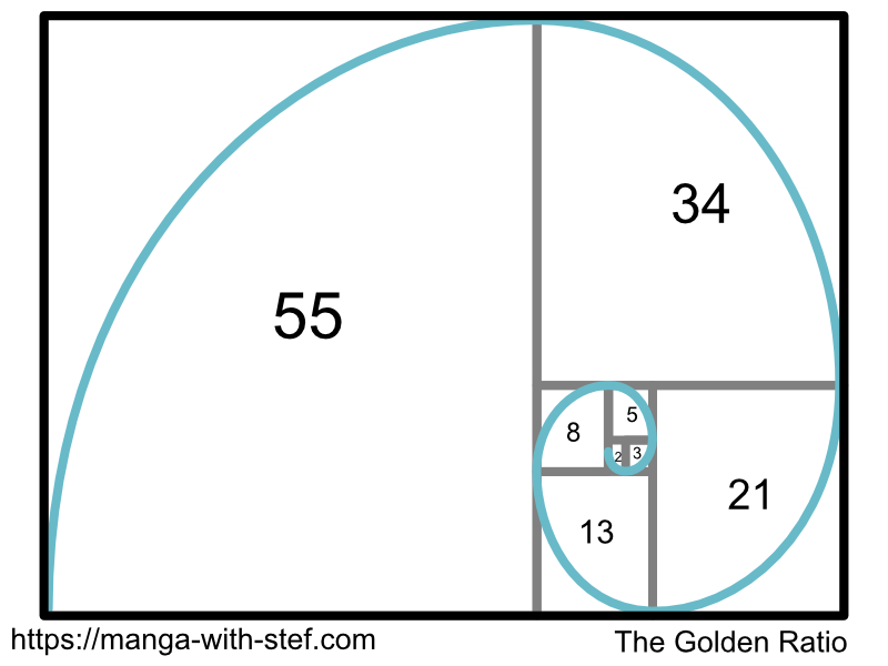
It became famous because, as the Divine was driving most artists in the past, they saw that many elements in nature followed the Fibonacci spiral. You can see it for instance in sunflowers, romanesco broccoli, snail shells… Moreover, as it looks natural, it is pleasing and harmonious for people to look at.
Many artists have used this spiral as a basis for their composition. It leads to an harmonious and dynamic experience for the reader.
Examples of manga panels composition
Now we are going to see how you can use these different principles in the composition of your manga panels. We will see a series of examples applying them and we will study their impact as a viewer/reader.
Symmetry and Centre Composition
The 3 panels below show different uses of the principles of Symmetry and Centre composition for the composition of some simple manga panels:
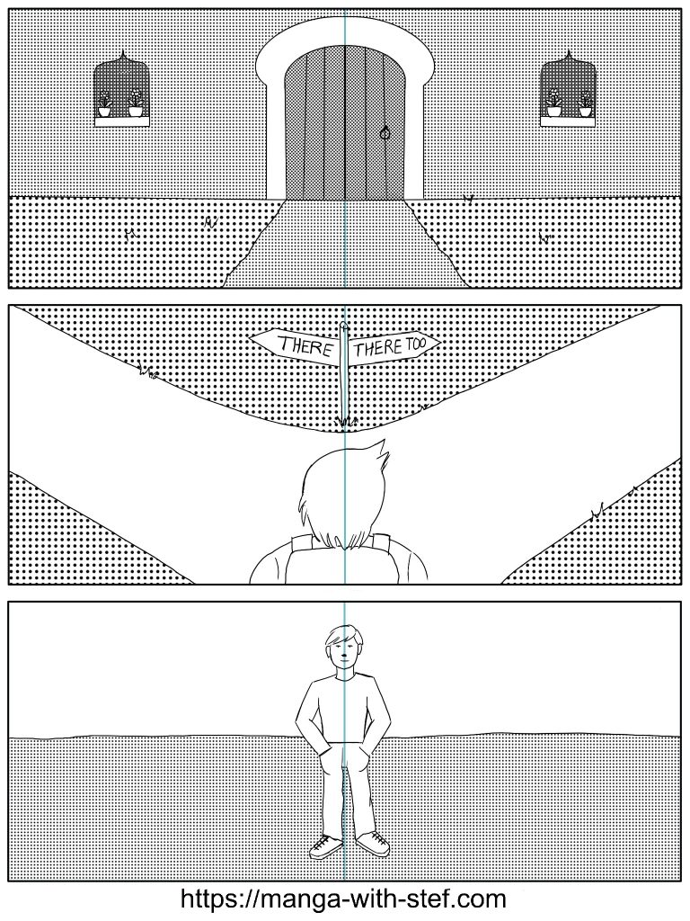
The first panel shows the use of symmetry to present an harmonious and welcoming setting. As indicated having symmetry will always bring some kind of satisfaction to the viewer. Moreover the door at the centre of the panel benefits from the combined effects of symmetry and centre composition, getting it a lot of focus as the resting point of the symmetry (the point where eyes don’t have to go left and right to check the symmetry).
The second panel uses this same symmetry principle to create tension by presenting two similar options to the character and the reader. No graphical clue seems to indicate that one way is better than the other. This therefore makes the reader experience the same dilemma as the character may do. He will be looking left and right to get some indication on where to go, but find nothing.
The third panel is a perfect example of the experience that is provided by the centre composition. This character, alone in the middle of the panel, gets the entire attention of the reader and seems to indicate an inevitable encounter. The fact that the environment around the character is empty reinforces the effect. You therefore have nothing else to look at that this character at the centre.
Balance
The 3 panels below are examples of composition of a manga panel introducing the settings for a scene with different levels of balance:
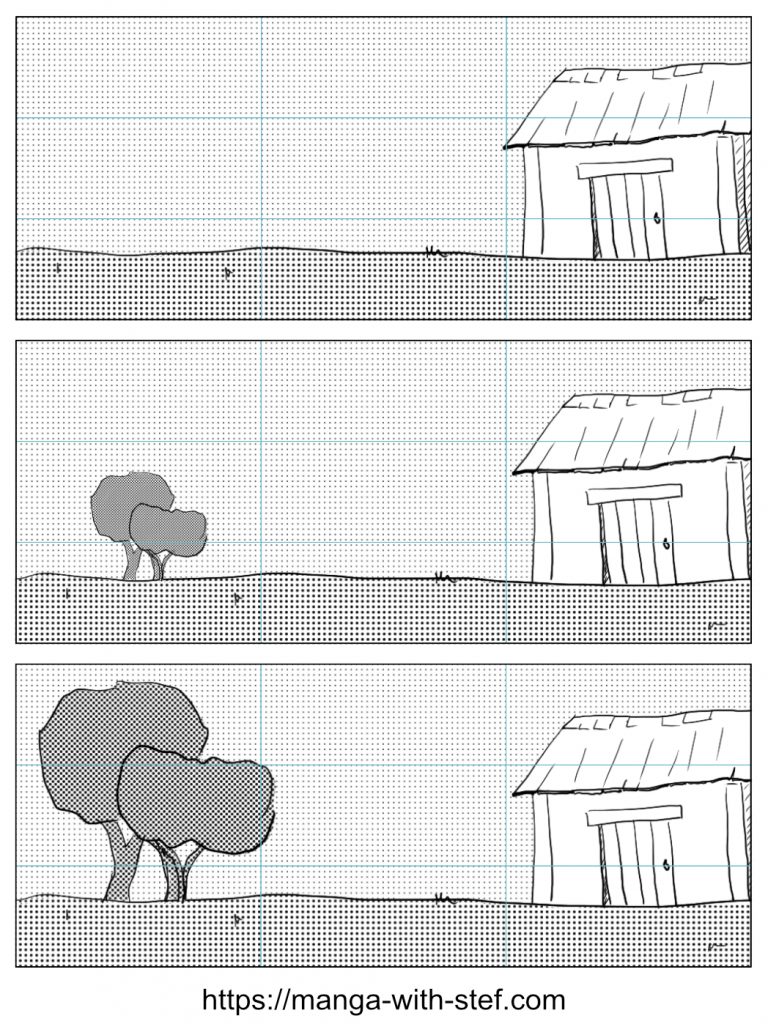
If you look carefully at these panels and take care to the movement of your eyes, you should be getting 3 different sensations due to the difference in balance of the scene.
The first panel is unbalanced. We have an house on the right, and nothing on the left. This makes this house the only element to contemplate. The eyes will be looking for something in that empty space, but finally go back to the house as there is nothing else to anchor the eyes. This unbalance shall give an impression of solitude due to the presence of this large empty space opposite to the house.
The second panel is also off balanced. Small trees are now on the left, which start to counter balance the house and break the emptiness of the landscape. Yet, due to their small size, dull colour and limited amount, the presence of these trees does not fully balance the one of the house. The house therefore remains the primary subject of the panel. We could have achieved a similar off balance effect by zooming in trees with just a part of their trunk visible.
The third panel is balanced. The space occupied by the trees is now similar to the one from the house. This leads to the house and the trees appearing as both being important subjects giving a feeling of harmony.
The Rule of Thirds and Centre Composition
In this second set of panels, I will show you how you could use the Rule of Thirds and the Centre Composition for the composition of your manga panels.
Example 1: The fishing boat
These panels show 3 approaches to framing a moving fishing boat on the sea, and highlight how the use of this framing can influence the perception the reader will have of the scene.
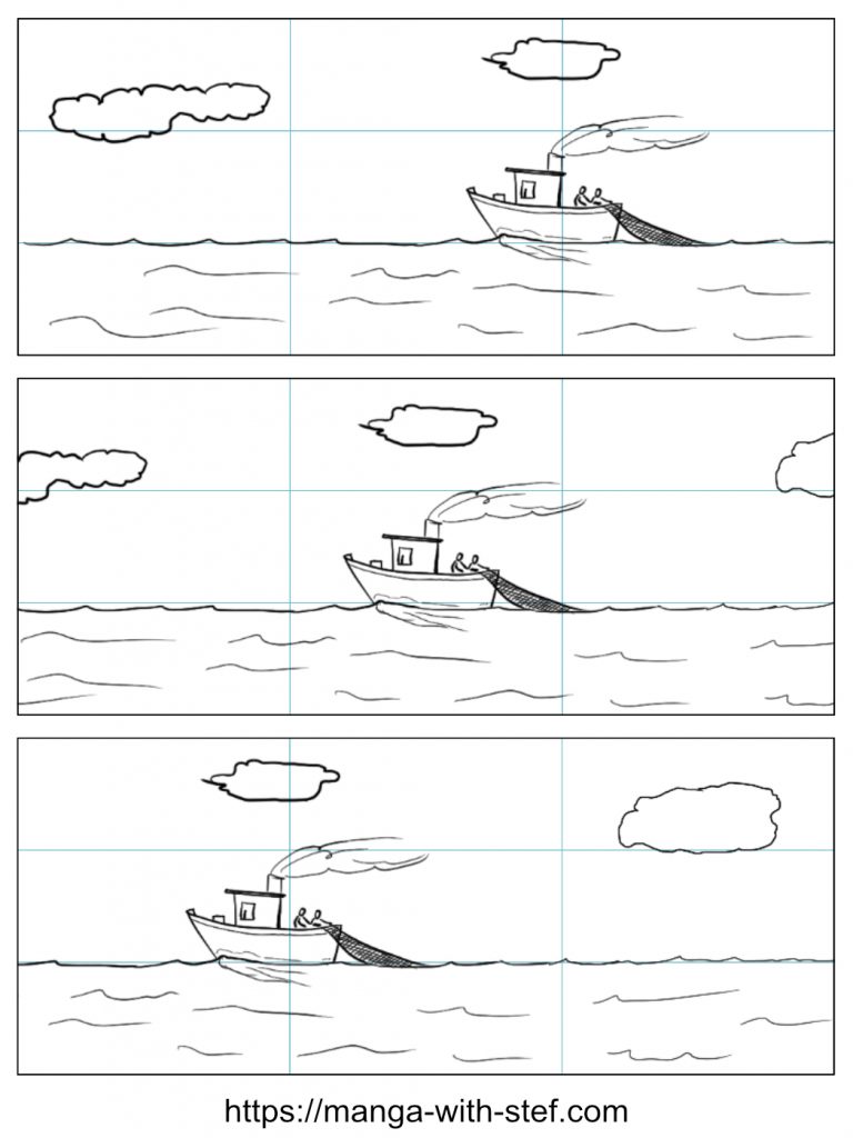
Top panel
Looking at the first panel you should see the combined application of the two principles of the Rule of Thirds:
- First, I set the horizon on the lower third of the frame. One third of the image is therefore occupied by the sea and two thirds by the sky, and feels harmonious. As the sky occupies 2/3 of the panel it quickly attracts the viewer’s attention and it is the primary part of the picture.
- Then we have a fishing boat on the bottom right focus point of the picture. Again, this position makes this boat fit harmoniously in the picture. The orientation of the boat with two thirds of the frame space available in front of it gives the feeling that the boat is moving towards the left.
Centre panel
On the second panel, the boat is now at the centre of the panel. This Centre Composition makes the boat the main subject of this panel. It occults all the elements around it, the sea, the sky and the clouds. They all become secondary as the boat systematically attracts your eyes to the centre.
To a certain extent, this panel leads to a feeling of discomfort. The trail of the boat and the smoke seem to indicate that the boat is moving, but the equal space on both sides of the boat makes it look as if it had stopped. In addition, the fact that the boat is so small in the panel makes it difficult to focus on what is going on onboard. The overall impression is therefore that the viewer doesn’t really know what is happening as there is no real information coming out of the drawing…
Bottom panel
Finally, on the third panel, the fact that the boat is facing left with just one third of the panel ahead leads to the feeling that this boat is stranger to the scene. The centre stage is now occupied by the sea and the sky, and the boat just seems to have temporarily disturbed the scene and to be about to get out of the stage.
Example 2: Captain taking a pause
This second set of panels is similar to the previous one, but here using a static character.
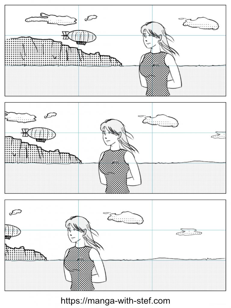
Top panel
In the first panel, we have the horizon line set on the lower third, which again drives the look of the viewer to the sky which occupies two thirds of the panel. Then we have the woman standing on the right third and looking to the other two thirds; her eyes are on the top right focus point which immediately drives the look of the viewer to her face. On the left we have a cliff and a zeppelin that bring balance to the scene. The zeppelin is also positioned on the top left focus point, but its small size compared to the woman make it secondary. Overall, the scene is pleasing to look at.
Center panel
If we look at the second panel, the woman is now taking the centre of the stage. As such she becomes the main subject of the panel, everything around her becomes secondary. But contrarily to the example of the boat above, the fact that she stays still makes this panel work. That character is the point of focus of the viewer (be it a character or the reader) who is contemplating her.
Bottom panel
On the third panel though, as for the third panel for the boat, discomfort arises again. The woman is staying on the left third, but her position gives her just one third of the panel ahead, while the other two thirds are in her back. It looks again as if she were stranger to the scene, a passerby. We are just waiting for her to leave the stage.
Note that even though some of these panels bring discomfort, they can be perfectly fine if the objective is to have the reader feel the discomfort of a character. This basically can amplify the feelings brought by the dialogues or the outcome of some actions.
Fibonacci Spiral
Finally, here are two examples of the use of the Fibonacci spiral for compositions:
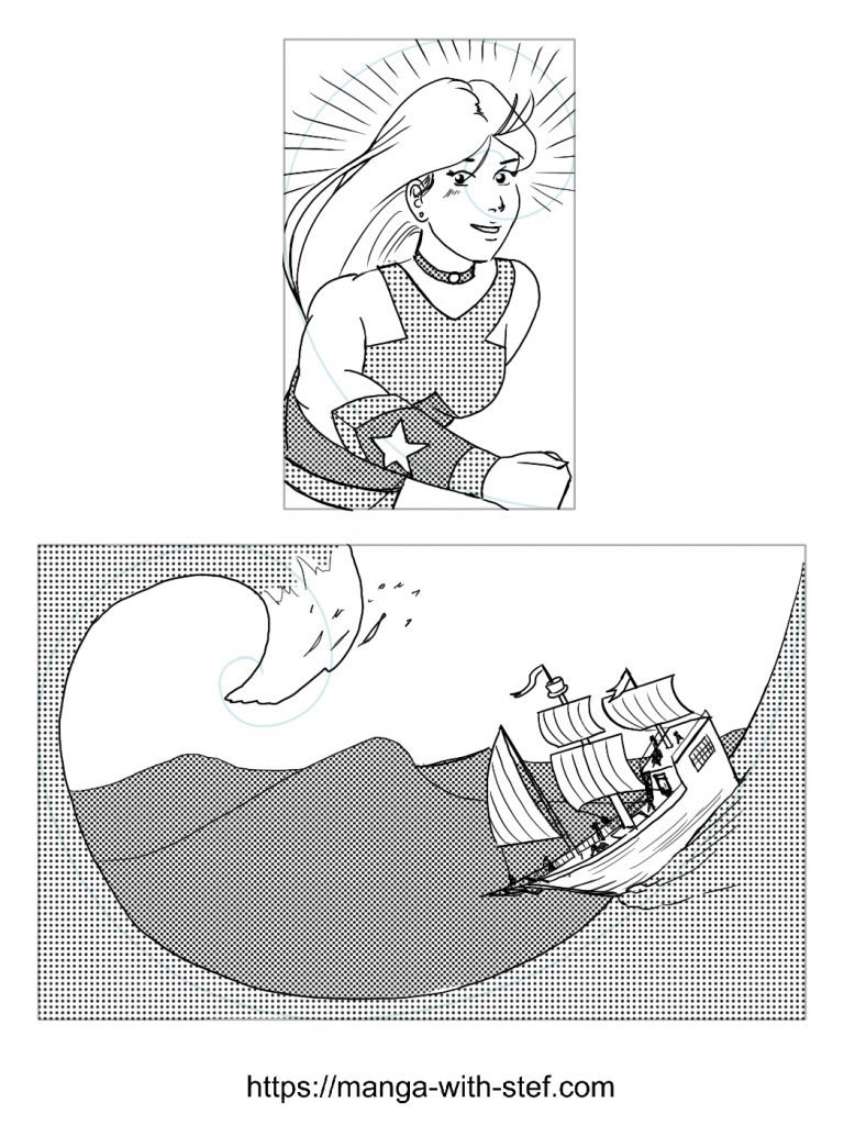
Top panel
The first panel shows the use of the Fibonacci spiral as a mean to frame a character in action. I positioned the eyes of the character on the converging part of the spiral as it attracts focus. Then I used the shape of the spiral to guide her hair and arm. This creates some harmonious and dynamic impression.
Bottom panel
The second panel shows a more epic scene. You might recognise a scene inspired by the the Great Wave of Kanagawa by Hokusai. Here the great wave follows the shape of the spiral. This gives again an impression of dynamism while still looking natural. The boat following the spiral also gets embarked in this effect.
Portrait framing
As a last example, we will see how the position of the eyes of a character in a panel can impact the reading of this panel:
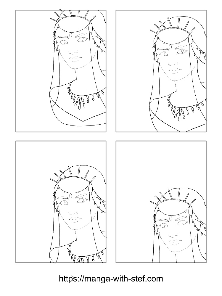
In the four panels above, I positioned the head on the left third of the panel. Because her eyes are looking to the right, with only one third of the panel ahead, the panels look strange. Whatever the vertical position of the character, the character seems to be looking around a corner, hiding or spying…
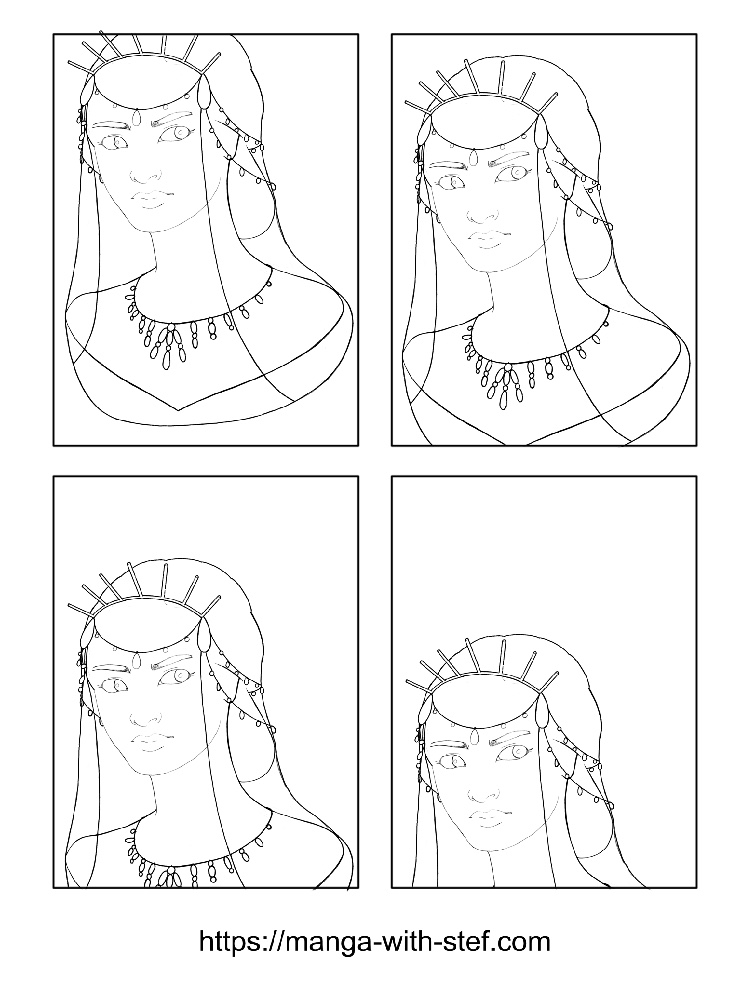
Now, on these four new panels I positioned the character’s head on the left third of the panel. This gives more headroom for the look of the character, making it look better in the frame and removing this impression of her being spying at something.
In the top left panel, I positioned the eyes close to the top left corner, the top of the head slightly out of frame. This position creates some unbalance. No element is really standing out in the panel and our eyes get lost, not really knowing what to look at.
In the top right panel, I set her eyes around the top left focus point from the Rule of Thirds. This position makes the overall portrait fit in the panel more harmoniously, attracting the look on her eyes, but making it easy to look at the other parts of the portrait.
On the bottom left panel, I placed the eyes on the centre line of the panel. This position makes that the eyes of the character attract all the focus and makes it difficult to look at the other parts of the portrait.
Finally, in the bottom right panel I aligned her eyes around to bottom left focus point of the Rule of Thirds. Again, the portrait looks somehow pleasing, principally because there is little to look at.
Improving the composition of your manga panels
As you have seen, a slight change in the composition of the panels of your manga can lead to a completely different interpretation of their content.
Therefore you should take the time to look at the composition of your manga panels and to check that the effect rendered is the one you expected. Do not hesitate to have others providing feedback on this specific point.
By default, the Rule of Thirds will be a good option for many compositions. And you can also use the Centre Composition to give focus to a character.
Always take care at where your characters are looking, or where your objects are moving, and give them some room.
If you want to test more complex compositions, you will have to experiment. Many artists will test different framing, with different compositions, and pick the best. This is somehow what I did with the boat and the woman. Create 3 or 4 panels, and position your subjects differently in these panels. Then pick the one that gives the best result.
This might not be perfect at the beginning, but with practice and experience it will come more naturally.
Also, do not hesitate to analyse the composition and framing of the panels of your favourite manga scenes. Look at the position of the characters, their eyes and the key elements of the setting. And then try to reproduce these in your panels. Getting inspired by our masters has always be a good way to improve.
I hope you found this article useful and informative.
Do not hesitate to ask questions or to share your feedbacks or experience. And do not hesitate to like and share 😉
See you!
Stef